ASOS
Founded in 2000, ASOS is an online retailer for “fashion-loving 20-somethings” around the world, to give its customers the confidence to be whoever they want to be. ASOS believes in the freedom to explore and express yourself without judgement.
In-house
🧥
Platform
📱 App
Quick links:
Objective Strategy
Process Research & UX
Designs UI
Tests & Findings Data
Objective Strategy
With some downtime, I initiated a brainstorm with two junior designers in my team.
With customer behaviours in mind, and our company goals; we discussed multiple ideas we felt could directly:
Enhance our customer experience by surfacing inspirational content and alternative products
Increase average basket value (ABV)
We know our customers struggle to create complete outfits while shopping through our app, unless they’ve been inspired by a post on our Instagram (@asos) and know exactly what they’re looking for.
In previous research, 78% of customers had told us that ‘the items they added to their saved items or bag are usually unrelated.’
We also identified the need for customers to know how to style items they already own.
We explored how we could solve this problem. After pitching a few high-level ideas to our Head of User Experience, our internal AI Team and a Product Manager dedicated to Discovery, we were given the green light to kick off a hackathon.
Process Research & UX
Our hypothesis was: By displaying complementary products, we would encourage customers to purchase items that worked together as an outfit. This would increase average basket value (ABV) and revenue per visitor (RPV). This feature would be referred to as ‘Outfit Builder’
To drive adoption to this feature, we would begin by referencing our customers’ past purchases (algorithmically and then in UI). With many of our customers being students and graduates, we know it's important for them to be money conscious and fashion forward.
We would test our hypothesis through A/B testing. We would compare the increase of ABV and RPV in the control vs customers who have added items to their to bag via the ‘outfit builder’.
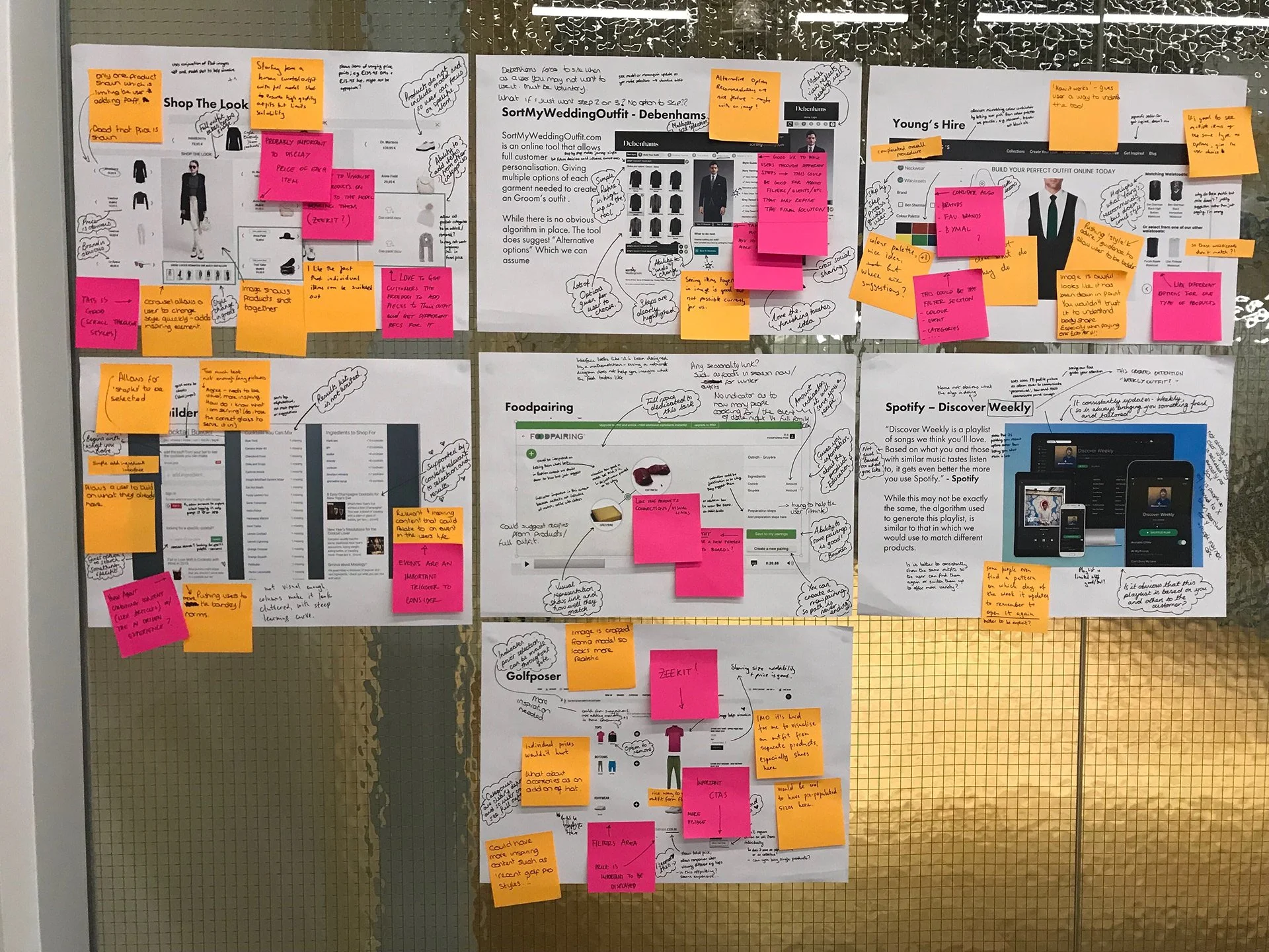
Day One: Research
Day One: Initial Ideation
Day Two: How can we use the algorithms we already have?
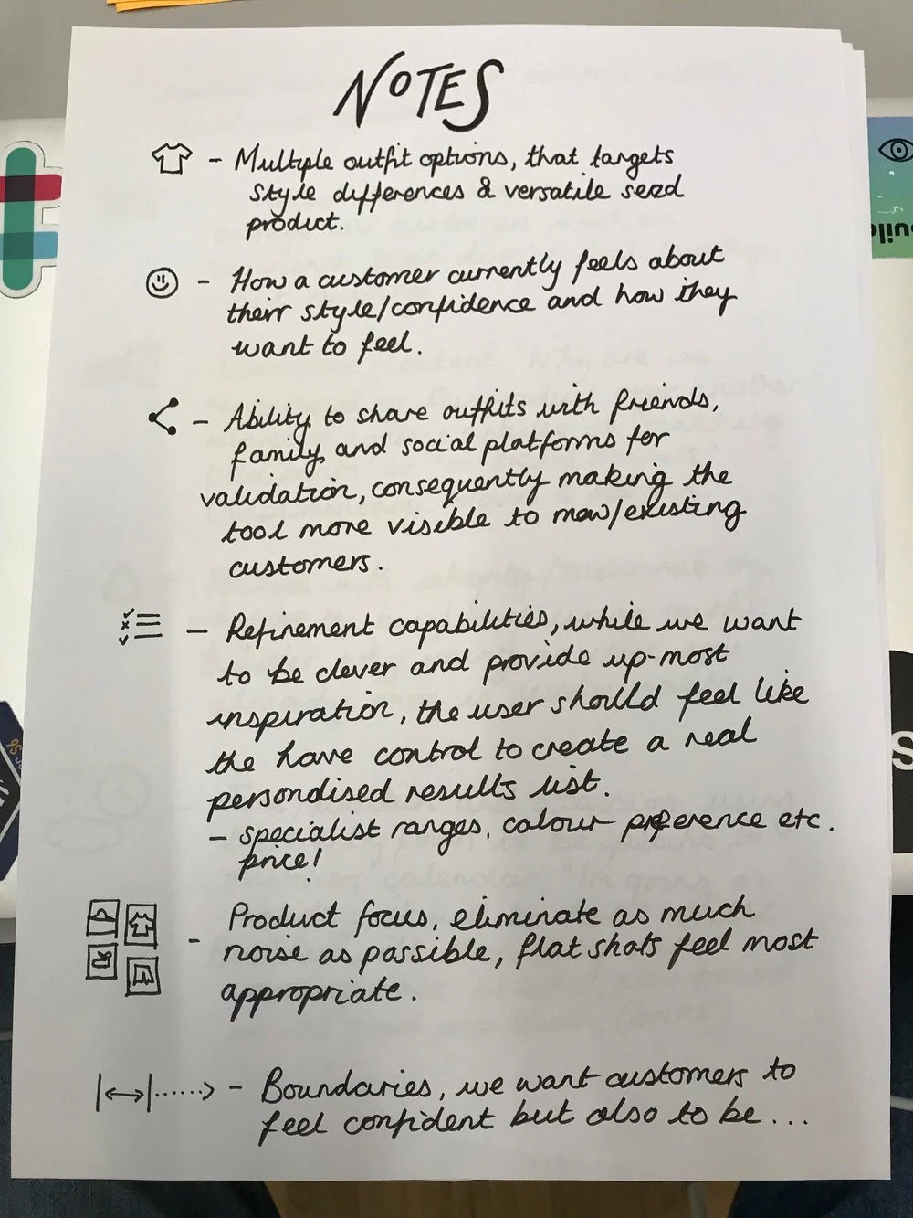
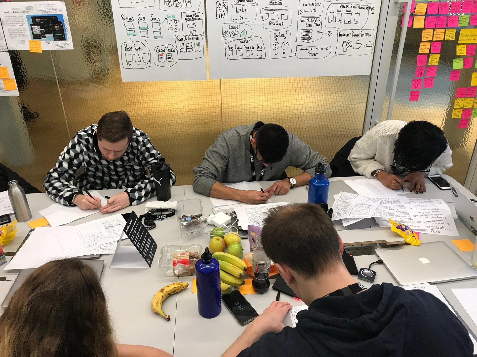
Day Two: Key attributes to consider.
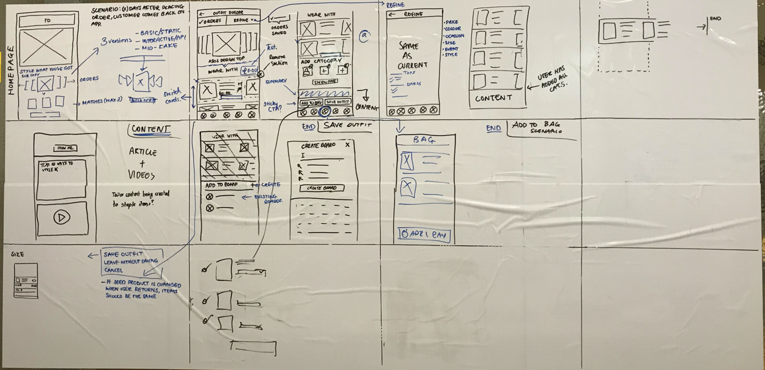
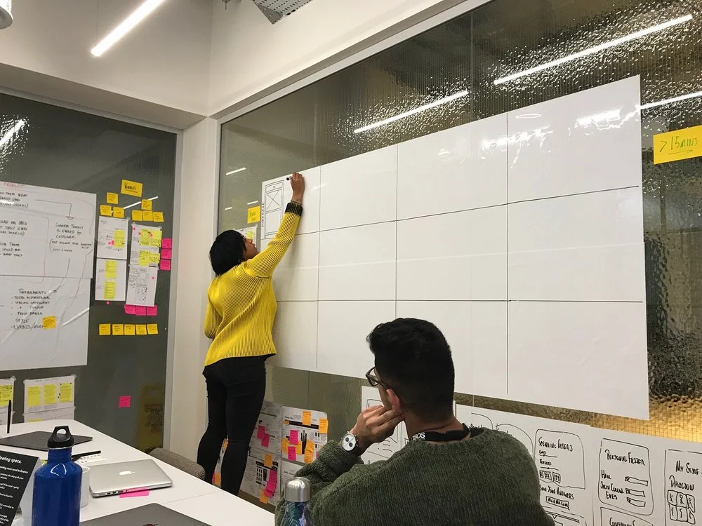
Day Two: Wireframes.
Designs UI
First draft UI and early prototype
Tests & Findings Data
We conducted 20 in-person user sessions and 50 remote sessions.
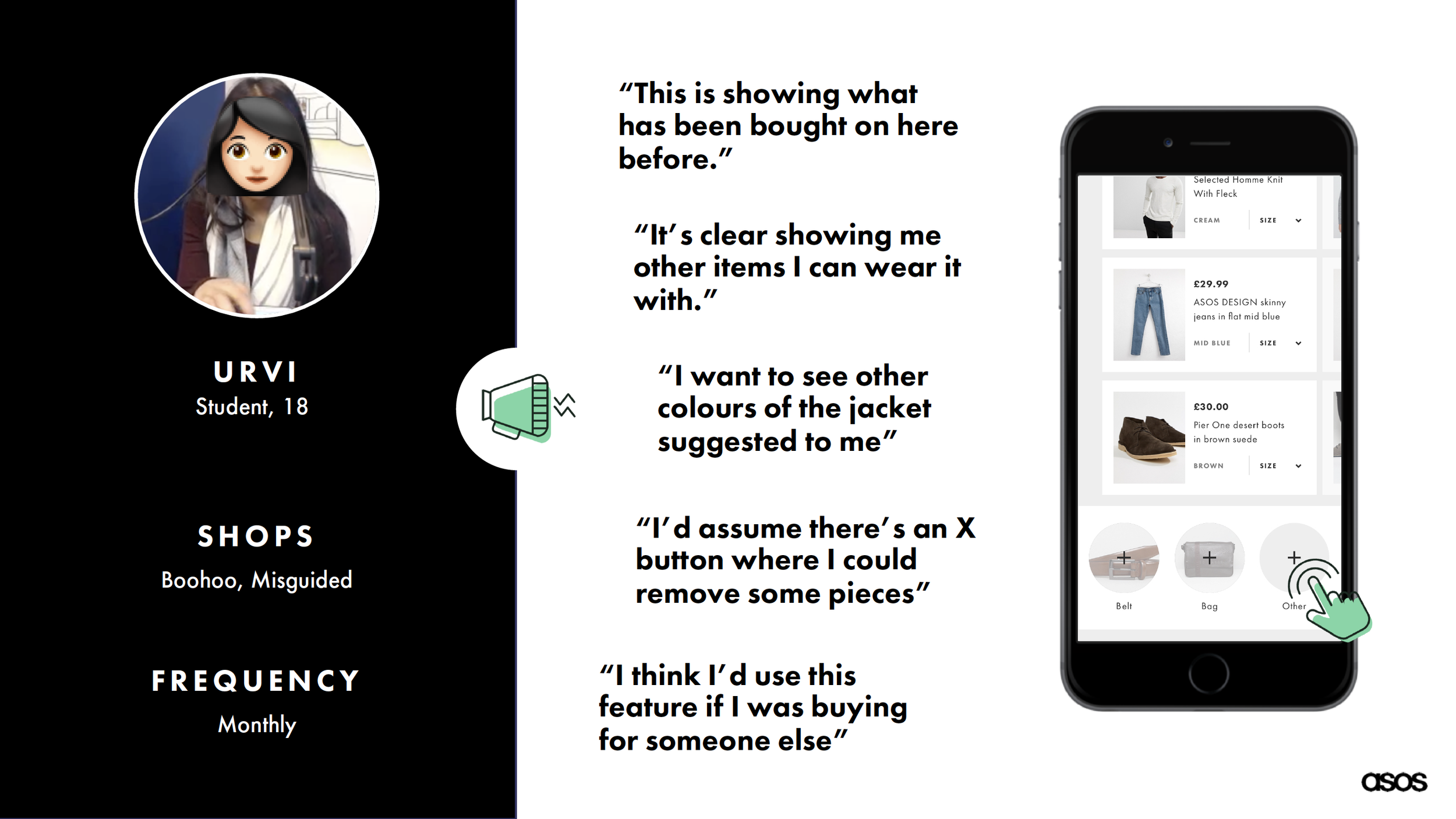
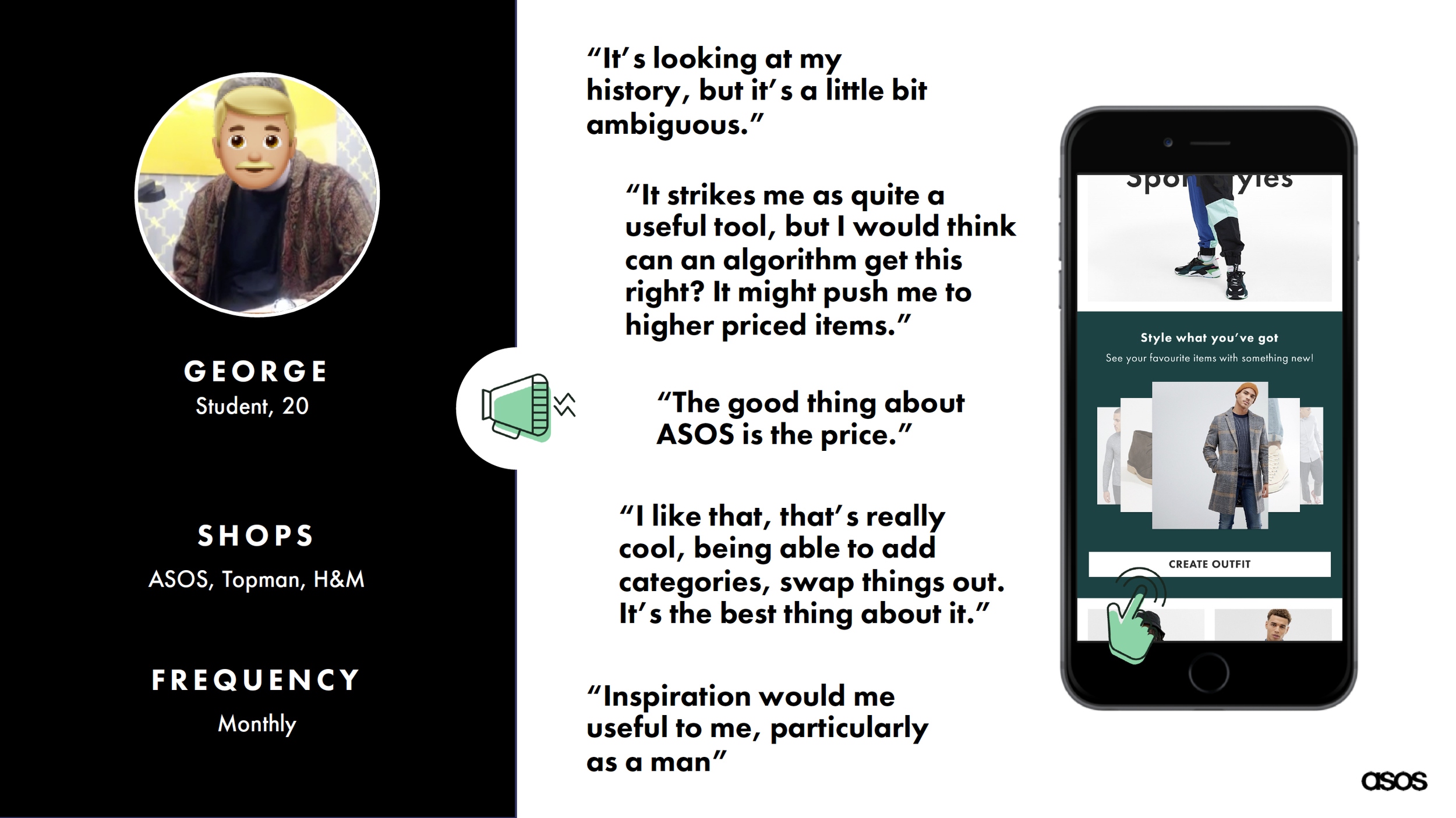
Our overall results were great, with all 70 users affirming they would use this feature when live.
They found the experience great for shopping for themselves and others, which is not something we initially thought of.
While listening and re-watching our users interact with the prototype, it was clear we had a few areas to further explore and focus on:
Viewing alternative ’wear it with’ product suggestions. Not limiting their choice of options at that moment.
Users were worried that our algorithm would leave many other customers with the same outfit suggestions, therefore decreasing individuality. One user also highlighted that they would be worried the algorithm would push higher-priced items, rather than just a ’stylist-like’ suggestion.
Ability to save the entire outfit to a board, including the previous item bought as it helps give context to the items suggested. It allows for further guidance when using the tool again.
Expanding our filter to accommodate those top level options users are used to seeing, i.e price and colour. Our original approach ‘Filter by context’ proved ambiguous, as one user thought ‘comfort zone’ was related to the fit, rather than how off-piste they wanted our suggestions to be, when compared to their usual style.
Users would like to see the outfit on a model or mannequin, but understood the difficulty involved.
These findings would inform our next steps.